Tutorial 1 - How to Age a Photograph in Photoshop
There are infinite possibilities and things you can do in Photoshop to make an image look older. It all depends on the look you want to achieve. In this tutorial, we will go over some tools and techniques that can be used to make your photograph look older and worn.
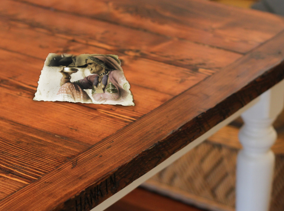
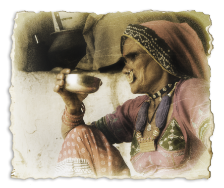
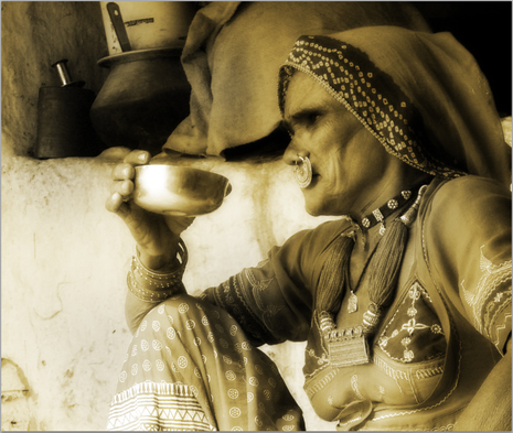
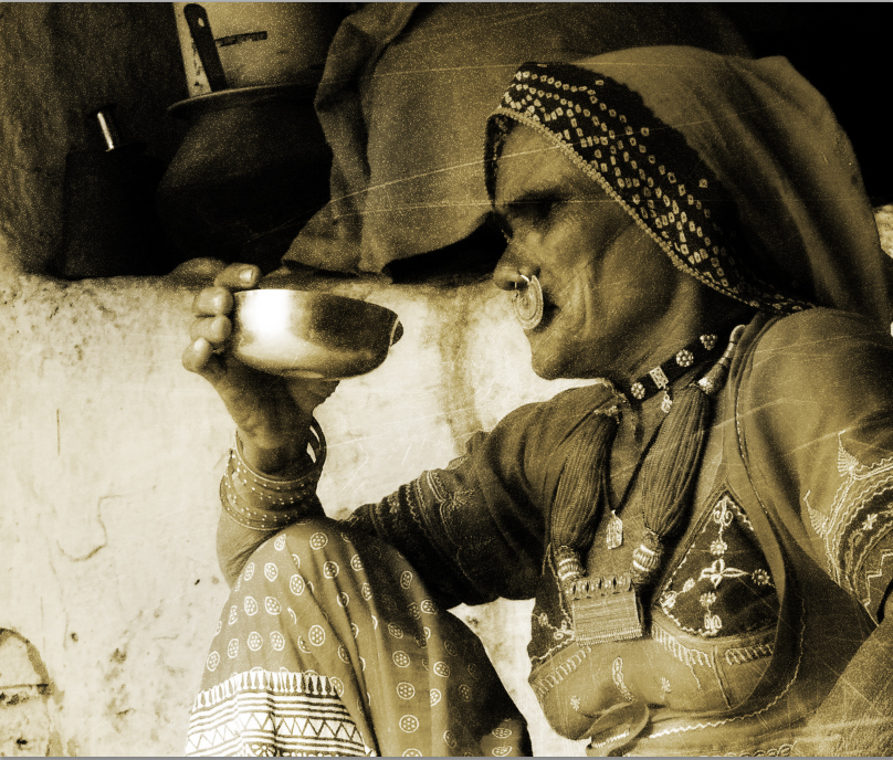
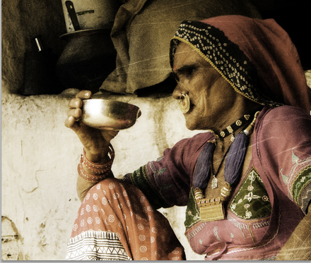
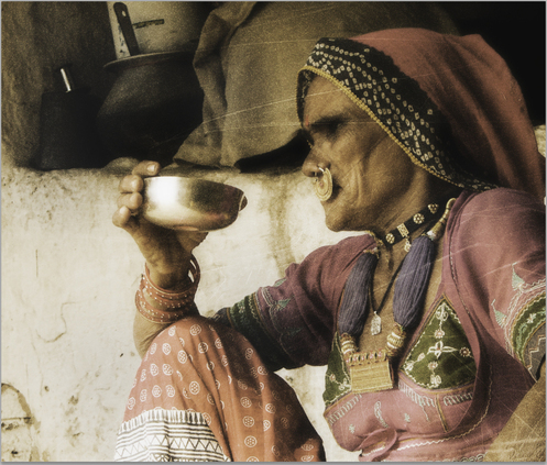
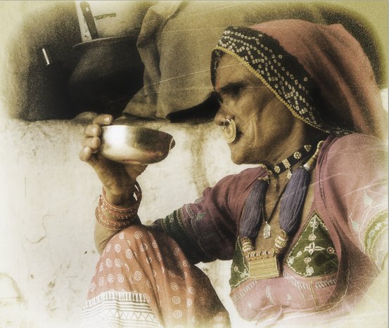
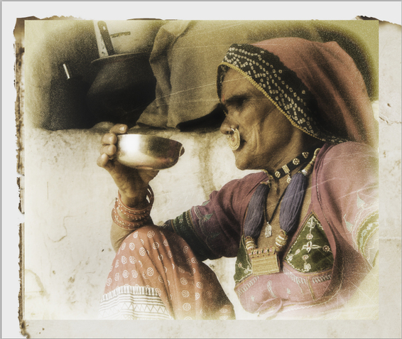
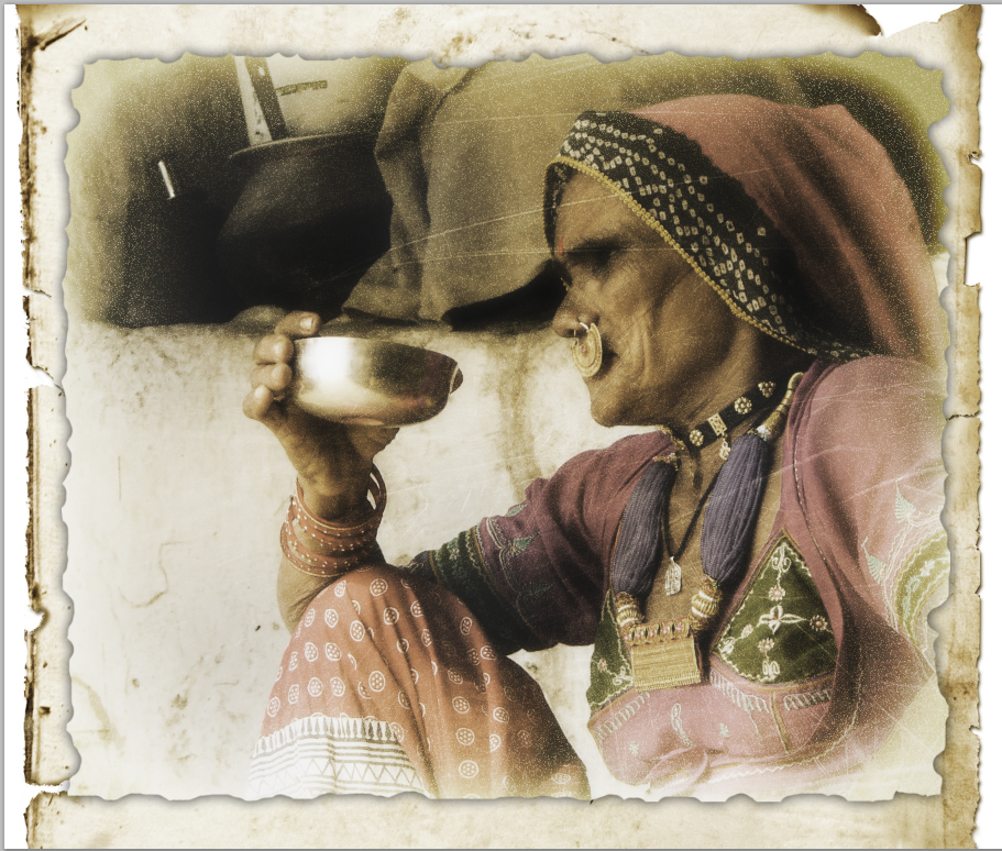
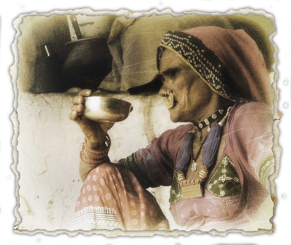
Here is our image, and what the image will look like when we are done:
Here is our image, and what the image will look like when we are done:

photo credit Tom Maloney
|
|
So, let’s get started.
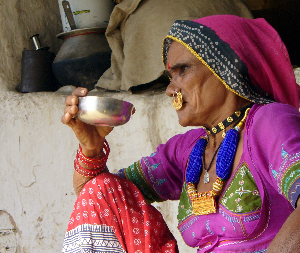
Step 1: Start up Photoshop and Open the Picture Provided.
You will find the picture inside Mrs. J’s folder (“Jurgensen”); you may also download it from the link below.
Step 1: Start up Photoshop and Open the Picture Provided.
You will find the picture inside Mrs. J’s folder (“Jurgensen”); you may also download it from the link below.
| banjara_with_tea.jpg |
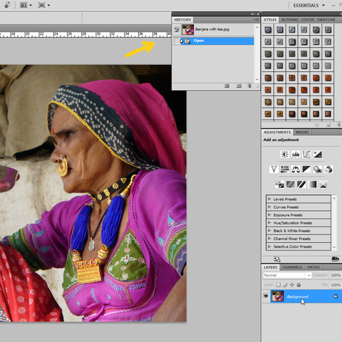
Step 2: Preparing your Picture and Workspace for Editing
Make sure your History window is open and visible. If you can’t see it, go to Window on the top menu and make sure History is checked. If it is already checked but you can’t see the History window, it is probably hiding, so just click it once to deselect it, and then click it again; this should make the History window visible.
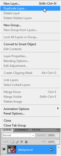
Under the Layers menu, click on the background layer. This layer is currently active, but it has a different set of functionality when comparing with other layers.
If you were to "delete" something from this layer, the area deleted would actually take on the colour of your selected background on Photoshop.
The following steps will ensure that this layer has the same functionality as any other layer; one of the things that will happen is, when you delete something on it, the background will now be transparent.
Make sure your History window is open and visible. If you can’t see it, go to Window on the top menu and make sure History is checked. If it is already checked but you can’t see the History window, it is probably hiding, so just click it once to deselect it, and then click it again; this should make the History window visible.
Under the Layers menu, click on the background layer. This layer is currently active, but it has a different set of functionality when comparing with other layers.
If you were to "delete" something from this layer, the area deleted would actually take on the colour of your selected background on Photoshop.
The following steps will ensure that this layer has the same functionality as any other layer; one of the things that will happen is, when you delete something on it, the background will now be transparent.
Under the layers menu, select the background layer, then click on the Layers options (top right of the Layers menu) and select Duplicate Layer.
Name this new Layer "Working Layer" and click OK.
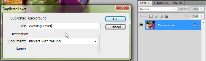
Now you have two layers with the same content: a Working Layer and a Background Layer.
Doing this is important because you should always keep an easily accessible version of your original image, in case something happens while you work.
Doing this is important because you should always keep an easily accessible version of your original image, in case something happens while you work.
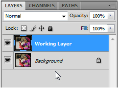
The next step is making your background active. This is going to be important later on; it will help us make a transparent background for our photo. To do this, double-click on your background. Rename it "Background" and click OK.
Yeah, I know, it's the same name... but it will work!
Yeah, I know, it's the same name... but it will work!
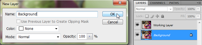
Notice how the font for "Background" turned from italicized format to regular? Magic! But now it is not locked anymore, which means we could make a mistake and destroy our spare.
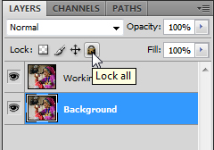
Just to be extra-safe with our spare background, let's lock it again, and make it invisible.
First, select the background layer and click on the little lock icon.
Just to be extra-safe with our spare background, let's lock it again, and make it invisible.
First, select the background layer and click on the little lock icon.
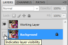
Now, click on the eye icon to the left of your layer menu. As you become familiar with Photoshop and creating composite images, this will become your BEST friend.
That's it! We're ready to start aging our photo.
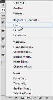
Step 3: Reduce Saturation of the Colours
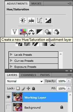
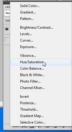
One thing that all old photos have in common is, they all look a little washed-out. The colours start fading with time. To replicate this effect, first, we will create a new adjustment layer. Adjustment layers allow you to test things out and have fun without the risk of destroying your image; you can have as many as you want, and test which ones you like best by making them visible and invisible.
To create an adjustment layer, you can click on the needed layer adjustment from inside the Adjustments panel (if it is open).
Another way to create a new adjustment layer is clicking on the half-moon icon on the bottom of the Layers menu.
Pick one of the following ways and click on "Hue/Saturation".
|
OR...
|
|
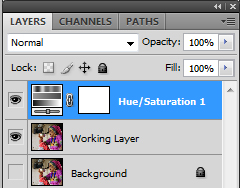
Now, you should see your new Hue/Saturation Layer on the very top of the stack of the Layers menu. If you click on this new layer, you will see the Adjustments for it pop up on the Adjustments area.
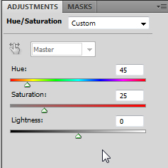
Click on COLORIZE.
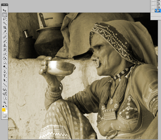
Then, change the Hue to 45 and the Saturation to 25 and your view window should change to something like the picture below and to the right.
Don't worry, we'll bring the colours back later!
Click on COLORIZE.
Then, change the Hue to 45 and the Saturation to 25 and your view window should change to something like the picture below and to the right.
Don't worry, we'll bring the colours back later!
|
|
|
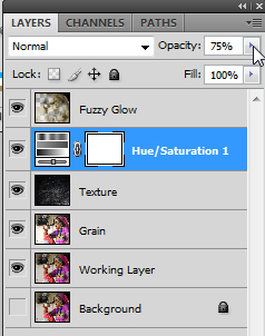
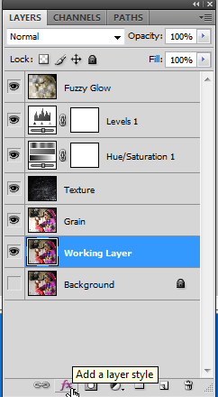
Step 4: Add some fuzz
Old photos sometimes have a fuzzy feel to some of the edges. This is because the older cameras did not capture pictures as fast and as efficiently as our cameras do today. Babies and children, particularly, looked a bit out of focus, even it they were right splat in the middle of the picture.
Let's add a little fuzz here and there to this picture. It's discreet but can add richness to the photograph.
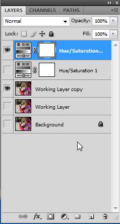
First, make a copy of your working layer AND a copy of your Hue/Saturation layer. Now, make both your originals invisible, just like the background layer.
Your Layers menu should look like this:
Old photos sometimes have a fuzzy feel to some of the edges. This is because the older cameras did not capture pictures as fast and as efficiently as our cameras do today. Babies and children, particularly, looked a bit out of focus, even it they were right splat in the middle of the picture.
Let's add a little fuzz here and there to this picture. It's discreet but can add richness to the photograph.
First, make a copy of your working layer AND a copy of your Hue/Saturation layer. Now, make both your originals invisible, just like the background layer.
Your Layers menu should look like this:
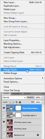
The next thing you will do is merge both new, visible layers. This will cause the adjustment layer to become a real, actual layer, which can be erased, modified and drawn on.
To do this, make sure one of the VISIBLE layers are selected, then go to the Layers settings and select Merge Visible.
This is why it is important to have other layers invisible... otherwise you will end up with one sad pancake.
To do this, make sure one of the VISIBLE layers are selected, then go to the Layers settings and select Merge Visible.
This is why it is important to have other layers invisible... otherwise you will end up with one sad pancake.
Your Layers menu should end up looking like this:
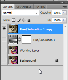
Now let's rename this new layer "Fuzzy glow". It's important to keep things organized in Photoshop otherwise you will go Ka-Razey eventually. So, get in the habit starting now!
Double-click on the name of the layer (Hue/Saturation 1 copy) and rename it, then press enter.
Double-click on the name of the layer (Hue/Saturation 1 copy) and rename it, then press enter.
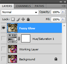
After we renamed the layer, we will be applying a filter to it. Filters help modify the layer; there are tons of filters available, and even more for download.
The thing is, unlike an adjustment layer, a filter modifies the layer PERMANENTLY... so if you changed your mind about something after doing a few more steps, you wouldn't be able to easily go back and remove the filter without removing the steps you have taken since applying the filter.
This is why we will keep our filter on a separate layer, and why we always have a backup.
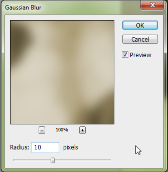
With the Fuzzy Glow layer selected, go on the top menu and select "Filter". You should see a series of filters available. Select Blur and Gaussian Blur.
The thing is, unlike an adjustment layer, a filter modifies the layer PERMANENTLY... so if you changed your mind about something after doing a few more steps, you wouldn't be able to easily go back and remove the filter without removing the steps you have taken since applying the filter.
This is why we will keep our filter on a separate layer, and why we always have a backup.
With the Fuzzy Glow layer selected, go on the top menu and select "Filter". You should see a series of filters available. Select Blur and Gaussian Blur.
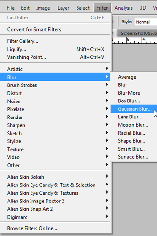
Radius decides the amount of pixels around each area that will be blurred. For our image, a radius of 10 looks pretty good. If you are working in the future with a lower resolution image, you may only need a radius of 4 or 5. The higher the resolution, the higher the radius you will need. If you have a monster image, a radius of 10 may not do anything visibly interesting, so use your best judgment.
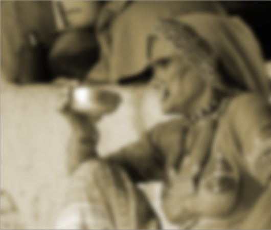
Your view window should look like this:
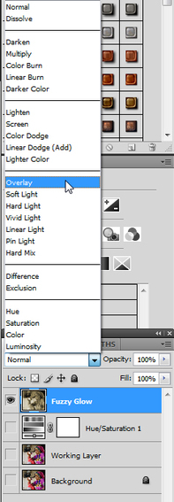
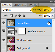
Now, we are going to change the blending mode for your layer, so that things can start getting interesting; Blending modes are also your best friends. You can find your blending mode right below the title of the Layers area; the default is "Normal". For this layer, make the blending mode "Overlay".
"Mrs. J., NOTHING happened!!!! This is still looking as boring as before!!!"
That's because all our other layers are invisible! Let's make our hue/saturation layer visible, as well as our working layer.
That's because all our other layers are invisible! Let's make our hue/saturation layer visible, as well as our working layer.
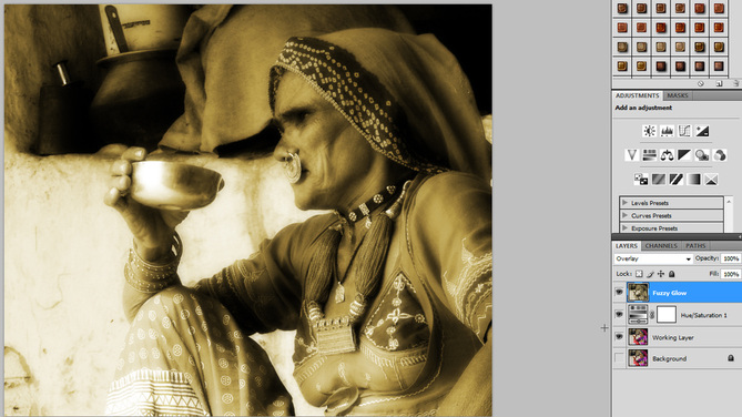
MUCH better!
Now, we will erase some of the fuzz. Usually an old picture is not so uniform. The most interesting images on Photoshop require a hands-on approach, so let's get to it.
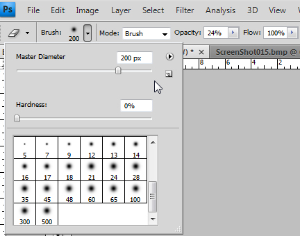
Select your eraser tool from the vertical tool bar. On the top left, type in 200 for brush size, put your hardness to zero, and reduce your opacity to about 20 - 25.
A hardness of zero will cause the edges of your brush to be fluffy, which is what you want.
Now, we will erase some of the fuzz. Usually an old picture is not so uniform. The most interesting images on Photoshop require a hands-on approach, so let's get to it.
Select your eraser tool from the vertical tool bar. On the top left, type in 200 for brush size, put your hardness to zero, and reduce your opacity to about 20 - 25.
A hardness of zero will cause the edges of your brush to be fluffy, which is what you want.
Click randomly on some areas that could use some sharpness. I chose to leave my figure fuzzy and click on the areas around her. You could choose to do the opposite. It all depends on what look you are going for.
Now, we are going to lower the opacity of the Fuzzy Glow layer. You can play with every layer's opacity and blending mode to achieve very unique results. Lower your Fuzzy Glow layer's opacity to 50%. The fuzz effect will be a bit more discreet now.
Step 5: Add some Grain
We want our photo to look a bit old and even pixelated. To achieve this, go to your layers menu, select your Working Layer and duplicate it, calling the new layer "Grain".
We want our photo to look a bit old and even pixelated. To achieve this, go to your layers menu, select your Working Layer and duplicate it, calling the new layer "Grain".
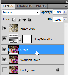
Go to the Filter menu again. Under the submenu Texture, select grain.
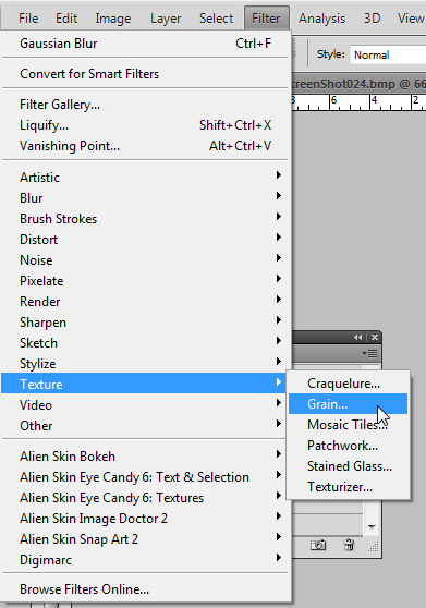
The Textures menu should load. Select grain type Sprinkles. Reduce the intensity to 12 and the contrast to 70, and click ok.
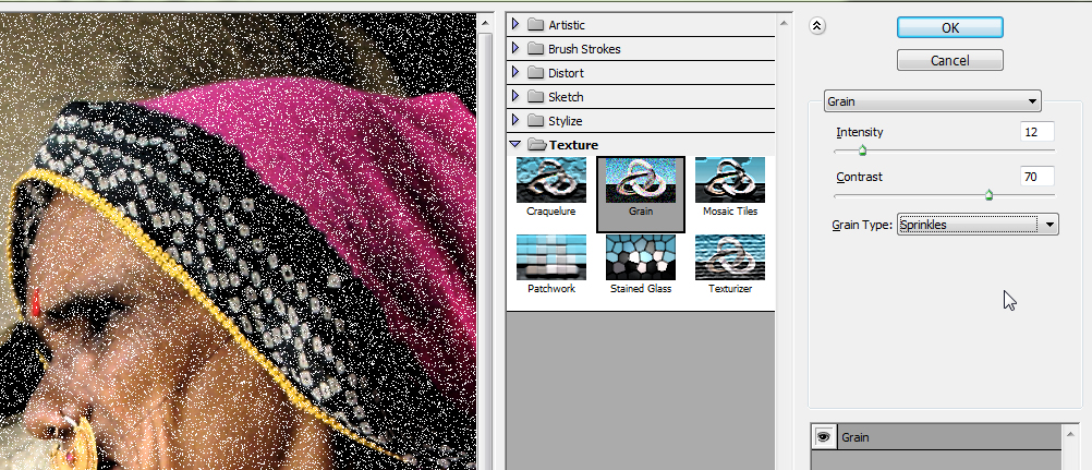
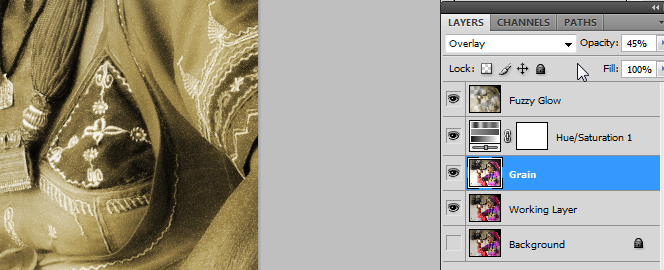
The result is pretty intense right now, so let's apply the overlay blending mode to our layer, and reduce the opacity to 45%.
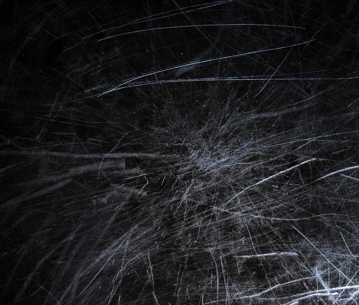
Step 6: Add a found texture
I want to see some scratches on my photo; there are many ways of doing this, such as using another grain filter, this time with vertical lines. But I want something even more random and realistic.
That's why one of the best things to do with photographs is adding textures to them. You do this by bringing in different images and pasting them to your image using different blending modes.
This is about a good time to SAVE YOUR WORK. Make sure to save as a Photoshop (PSD) file, so that all your layers are included.
Now on to the texturing. First, we need our texture. Open the file "Texture" under the Tutorial 1 folder, or download the file below.
| texturescratch.jpg |
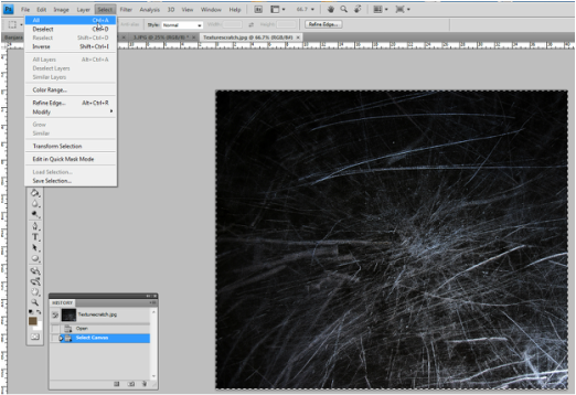
Select the image by going into the top menu, clicking "Select" and then "All".
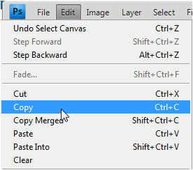
Next, under the Edit menu, click copy.
This will save the selection to the clipboard, allowing you to paste it onto our image.
Next, under the Edit menu, click copy.
This will save the selection to the clipboard, allowing you to paste it onto our image.
|
|
Click the tab for our image, go back to Edit and select Paste.
As you can see, our texture is now on top of our image, but it is quite a bit smaller.
As you can see, our texture is now on top of our image, but it is quite a bit smaller.
To
correct this, with your texture layer selected, go to Edit ->
transform -> Scale. Usually we would want to scale something in
proportion, but there is no need to worry when you are using textures,
so just drag the texture's corners so they match our image.
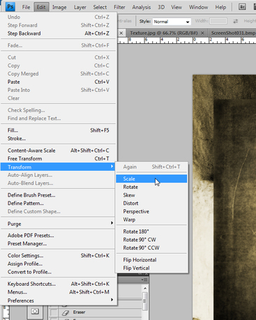
Now that our texture and our image match, we can rename the texture layer "texture.
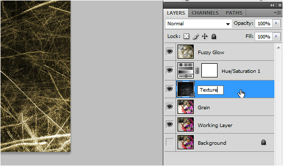
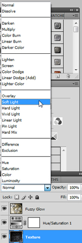
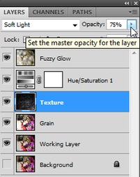
Change the blending mode for our layer to Soft Light, and change the opacity to 75%.
|
|
You should be seeing something like this:
Step 7: Colorize
Now, let's add some colour back, because this sepia tone is making me sick already. Right? Right!
To do this, simply select your Hue/Saturation layer and lower your opacity to 75%. That means it will now allow 25% of the colours from our working layer to show through.
Now, let's add some colour back, because this sepia tone is making me sick already. Right? Right!
To do this, simply select your Hue/Saturation layer and lower your opacity to 75%. That means it will now allow 25% of the colours from our working layer to show through.
Your image should look like this:
Step 8: Reducing Intensity of Whites and Blacks
One thing you notice from the photograph above is that the contrast is still very present. However, old photographs have a tendency of losing some of the intensity of the darkest tones, while the whitest tones tend to fade off as well.
To correct this, let's create another adjustment layer; this time, it will be a Levels layer.
Levels is very useful for enhancing photographs! You can use the eyedrop tool to select what will be your whitest white, and what will be your blackest black; it really makes contrasts and colours pop.
For this tutorial however, we are using the Levels layer to reduce our contrast in a smart way.
First, create the new adjustment layer.
Now, under output levels, you will see two boxes. The first box controls the black tones, and the second box the white tones.
You will change the first box to 35 and the second box to 235. This will bring both arrows on the gradient bar closer together, and that is what you want.
You will change the first box to 35 and the second box to 235. This will bring both arrows on the gradient bar closer together, and that is what you want.
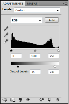
Your viewing window should show an image similar to the one below.
Isn't this nice. Looks just like an old picture with really sharp borders. That's not very realistic! Let's keep going!
Step 9: Fading the Sides and Corners Away
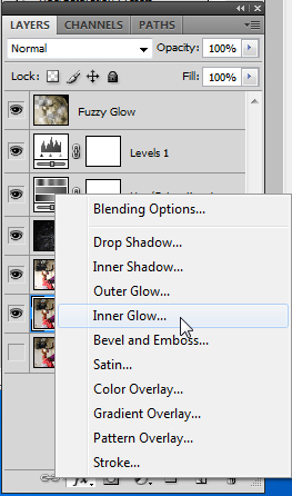
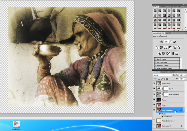
There are tons of ways to fade the sides away, but this time, let's do this by using a layer style on our working layer.
The good thing about styles is that they can be easily removed if we don't like it.
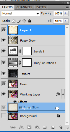
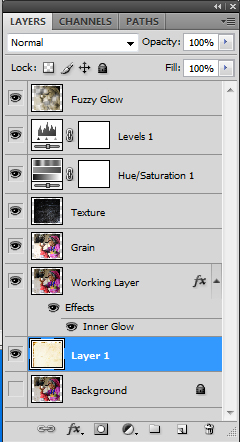
Select your working layer; now, click on FX below the layer panel. When the selection list appears, select "Inner Glow".
There are tons of ways to fade the sides away, but this time, let's do this by using a layer style on our working layer.
The good thing about styles is that they can be easily removed if we don't like it.
Select your working layer; now, click on FX below the layer panel. When the selection list appears, select "Inner Glow".
|
|
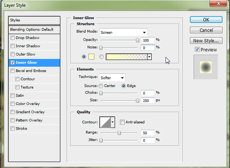
When the menu appears, make sure your Preview box has a check mark on it. Always do this whenever possible.
Notice how the FX box has all the possible effects or styles you may want to apply. You can always come back later and change the parameters for every layer. It's a very useful area in Photoshop; this is where you will find things such as drop shadows and 3-D effects.
For now, change your opacity to 100% and your size to 250, and click ok.
Your image should look like this:
Step 10: Adding the Paper Background
Your image looks much better, but to make it look like an actual old photograph, let's take a few more steps.
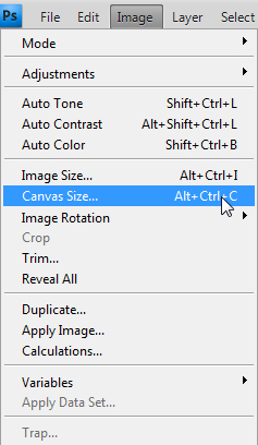
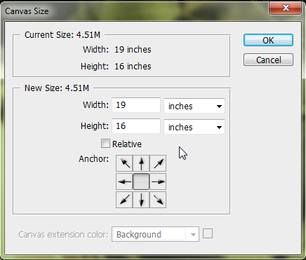
First, increase the size of your canvas by going under Image and selecting Canvas size.
Then, under width, make sure it is raised to 19 inches, and height is raised to 16 inches.
Leave the anchor in the centre; this will make your canvas area expand around your picture.
Your image looks much better, but to make it look like an actual old photograph, let's take a few more steps.
First, increase the size of your canvas by going under Image and selecting Canvas size.
Then, under width, make sure it is raised to 19 inches, and height is raised to 16 inches.
Leave the anchor in the centre; this will make your canvas area expand around your picture.
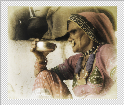
|
|
See how there is a transparent border around your picture? If we had not activated our background in the beginning, this border would be the colour of whatever your background is.
Let's add a paper layer to the very back of our image. To do this, open the file paperbackground found in the Tutorial 1 folder, or download the file below.
| paperbackground.jpg |
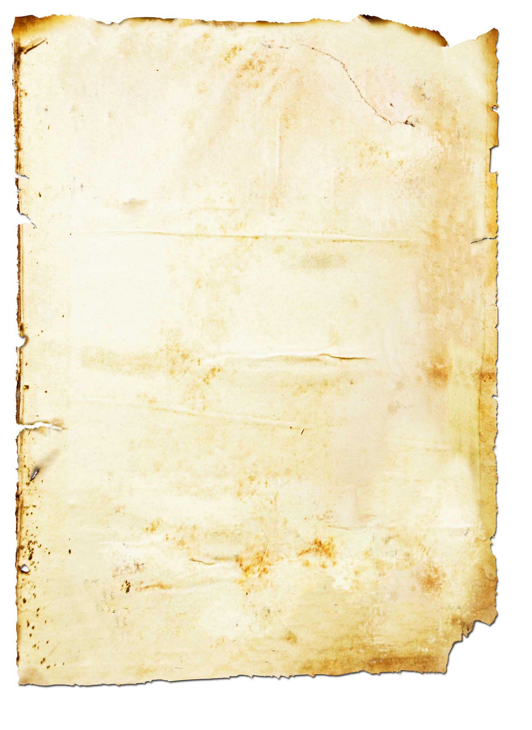
Now, just like we did to add the scratch texture, open the file, select it all, copy it, then go to our working file and paste it into the file.
You should have something like this in the end:
You should have something like this in the end:
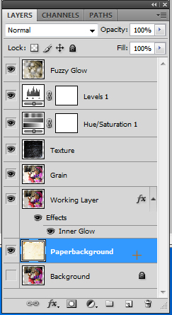
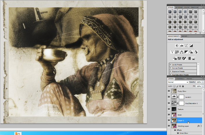
Now we can't see anything! That's bad. Let's reorder the layers so that this layer is on the bottom of the pile, just on top of our protected background layer.
To do this, go to the layers menu, click on the new layer with the paper, and while holding the mouse button, drag it until you are on the right spot, then release.
When you are done moving the layer, rename it Paperbackground.
To do this, go to the layers menu, click on the new layer with the paper, and while holding the mouse button, drag it until you are on the right spot, then release.
When you are done moving the layer, rename it Paperbackground.
|
|
|
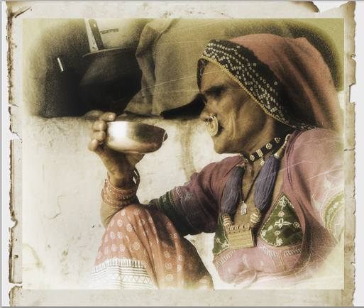
Your image should now look like this:
Now, make sure your paper background layer is still selected, and reduce the size of the layer by going to Edit -> transform again. But this time, make sure to click the chain symbol on top, so that the reduction is proportional, and then type 80 on either the W or the H amount.
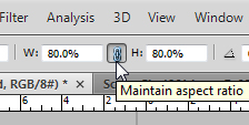
Click on the selection tool, and click Apply to make the scaling permanent. Now, move your layer a little so that it is more centered on your picture, like this:
Step 11: Combine layers into a new layer
Here comes the tricky part.
It's VERY tricky!
But if you do it right, it will save you a lot of time!
We need to make a layer that is a combination of all the layers we have, minus the background and the paper layer.
To do this, first, make the paper background layer invisible, just like the background layer. Then, select the layer right above it.
Now, hold the Alt key. While holding the alt key, click and hold the Layers options, to the right.
You HAVE to click and hold because Photoshop really doesn't want to do it! It's ok, it will work!
Go over to Merge Visible and release the mouse button.
Ta Daa! Now you have a new layer, called Layer 1, which is a combination of all the other layers, and you still have a copy of all the other layers. So, it's a very safe procedure.
If you did this step and all your layers disappeared, you did a booboo somewhere... But it's OK, that's why we have the History menu open at all times.
We want to make sure our new layer is on the very top. As you can see, our Layer 1 is not on the right spot. Select and move the layer to the very top of the pile following the same procedure we did before. Now, rename the layer "Picture".
We want to make sure our new layer is on the very top. As you can see, our Layer 1 is not on the right spot. Select and move the layer to the very top of the pile following the same procedure we did before. Now, rename the layer "Picture".
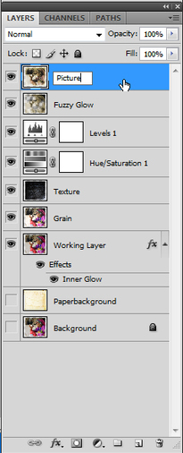
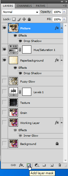
Make all layers invisible, except for the picture layer, the Hue and Saturation layer, and the Paper background.
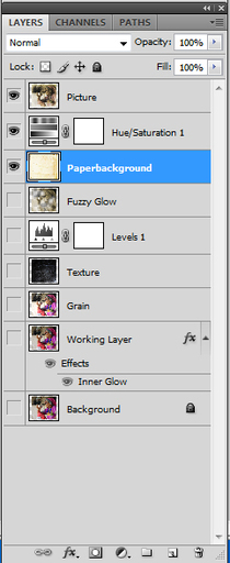
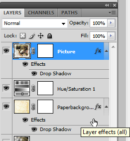
Step 12: Add Styles to Picture and Paper Background Layers
Now we need to give the layers a style.
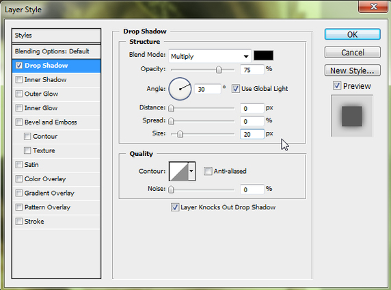
Add a Drop shadow to your Paper Background. This will help us see where we are going from here. To do this, click on FX and choose Drop Shadow.
On the menu, change Distance to zero and Size to 20.
Now we need to give the layers a style.
Add a Drop shadow to your Paper Background. This will help us see where we are going from here. To do this, click on FX and choose Drop Shadow.
On the menu, change Distance to zero and Size to 20.
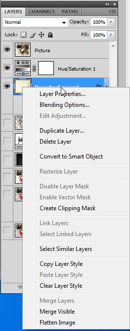
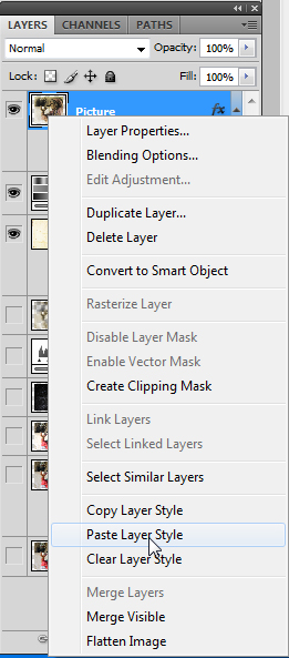
One of the cool things about styles is that you can copy and paste them from layer to layer. To do this, just right-click on your Paper Background layer, select Copy Layer Style, then right click on the Picture layer and select Paste Layer Style.
|
|
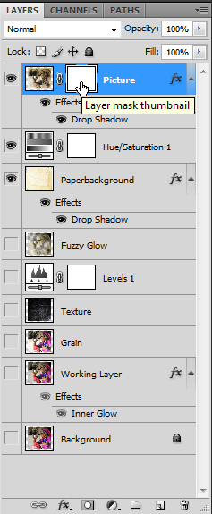
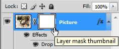
Step 13: Masking and Erasing our Layers
Your layers are now ready to mask your layers. Masking will help our paper look realistic.
To do this, on the Picture layer, click on the masking icon under the layers menu and add a mask to your layer.
Your layers are now ready to mask your layers. Masking will help our paper look realistic.
To do this, on the Picture layer, click on the masking icon under the layers menu and add a mask to your layer.
|
|
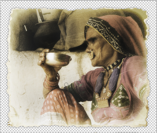
Do the same procedure to your Paper Background layer. The result should look like this:
Now, SAVE your work... danger ahead!
In fact, make a copy of your Paper Background and your Picture layer, just in case... I didn't do this, and when I tried to go back later, somehow the map had merged with the layer. That is why the result looks like a RAT ATE THE BORDERS! Better safe than sorry... make copies of both layers and make them invisible before you add the mask!
Go to the Picture layer and click on the mask itself -- make sure the mask is selected and that little blue bars appear on the top and sides. Otherwise, if the actual image to the left is still selected, when you alter your image, the original image will be altered, and not the mask. Be careful with this step.
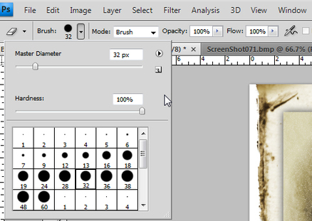
Pick the eraser tool, and make the hardness to the max. Choose a size around 30 or so. You can always change this later; the good thing about masks is, you can erase it and then, if you want the original image to come back, you just use your pencil again.
Here I go using my eraser tool on my mask. La la la la la.
ATCHOOOO! Oh CRAP, what now?
It's OK, just grab your brush tool and paint over the areas you want to put back. The mask will bring back the pixels found in the original.
|
|
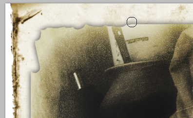
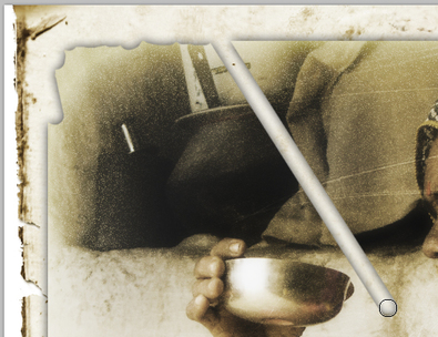
Keep erasing your picture's border until you end up with a ragged edge like this. I made mine really exaggerated (and couldn't fix it, boooo) but you can make it a bit more straight if you like. Just keep using the eraser and the paintbrush to remove and add bits of picture.
Now, do the same for the background.
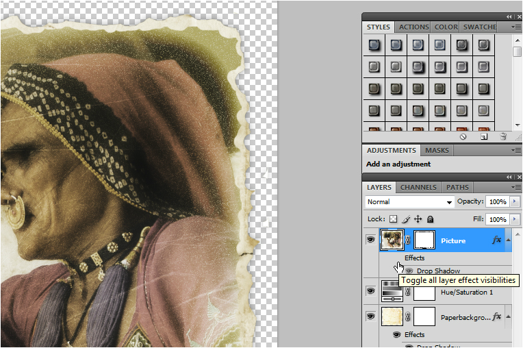
Click on the little eye symbol next to the Effects, underneath the Picture layer, to turn off the Drop Shadow.
I kept playing with my borders until I was happy. This is what I have so far. Make sure to erase everything in the layer that doesn't belong, including any artifacts.
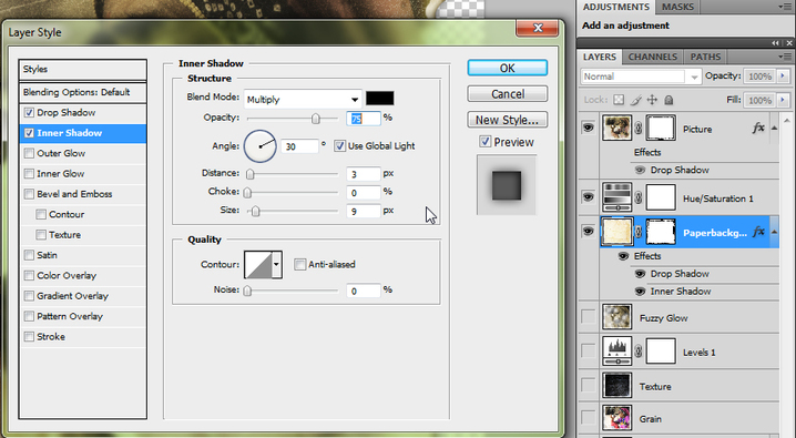
To add a little bit more interest to my picture, I want the edges to look a little burned. The easiest way to do this in this case is to use an Inner Shadow. To add an Inner Shadow, double-click the Effects right under your Paper Background layer, and on the new menu, select Inner Shadow. Set opacity at 75%, Distance at 3 and size at 9.
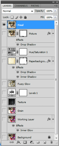
Now, you will do the same thing we did before and merge these three layers into a new layer.
To do this, again, hold down Alt, then go to the Layers menu, click and hold; when you finally get to Merge Visible, release the mouse button.
Rename this new layer Final, and again, make all other layers invisible.
To do this, again, hold down Alt, then go to the Layers menu, click and hold; when you finally get to Merge Visible, release the mouse button.
Rename this new layer Final, and again, make all other layers invisible.
Now we're going to rotate the Final layer so it is sitting at an angle.
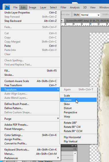
Grab one of the corners of the picture and rotate it. When you are happy with the angle, click on your selection tool; a menu will pop up. Click "Apply".
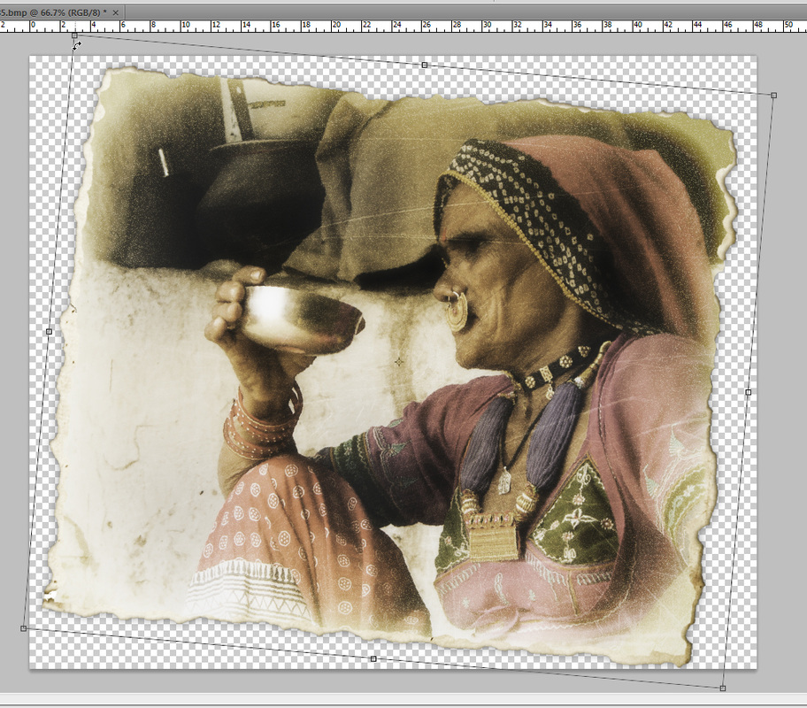
Now, SAVE your PSD file; but you also can save this picture as a PNG. PNG is a great format for keeping the background transparent; it is also a lossless file type.
JPG, while great for saving space, loses a lot of info because every time you save it, it compresses and every time you open it, it decompresses; if you do this a few times, you really start to notice a loss in quality.
You can use an image without background for many things. You can overlap them, place them on objects, ...
Images with no backgrounds are particularly good for designing logos and graphics that you need to put on a variety of places.
That's it for today! Hope this was interesting for you! :)
Click and go to Extra 1 to continue tutorial series!