Tutorial 9 - Introduction to Adobe Illustrator
Alright, this is it! We're finally going to experience some Adobe Illustrator!
Since we now have a little experience with Adobe Photoshop, many of the things we will see in Illustrator will seem natural and familiar.
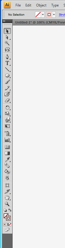
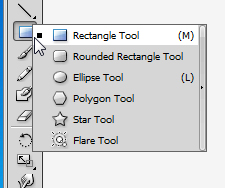
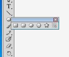
For instance, the toolbar located to the left has many of the same tools, and just like in Photoshop, if you click and hold on the small black triangle underneath each one, more options for that particular tool appear.
By clicking on the small black arrow to the right of the options, you can also UNDOCK the different tools for easy access. This can be VERY useful when you are doing a complex design; organizing your desktop exactly how you want it is a real time saver!
Since we now have a little experience with Adobe Photoshop, many of the things we will see in Illustrator will seem natural and familiar.
For instance, the toolbar located to the left has many of the same tools, and just like in Photoshop, if you click and hold on the small black triangle underneath each one, more options for that particular tool appear.
By clicking on the small black arrow to the right of the options, you can also UNDOCK the different tools for easy access. This can be VERY useful when you are doing a complex design; organizing your desktop exactly how you want it is a real time saver!
|
|
|
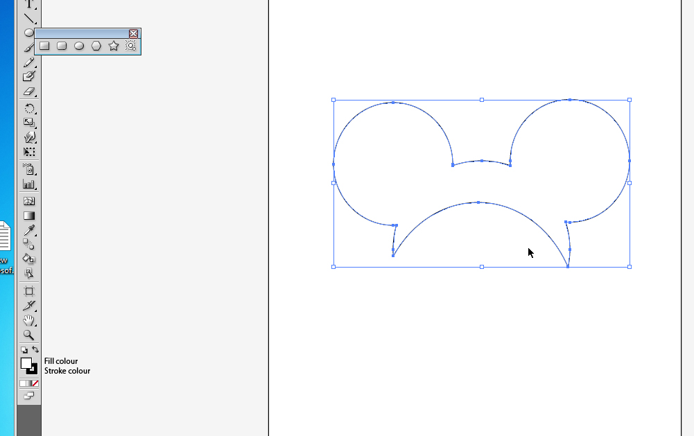
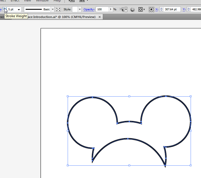
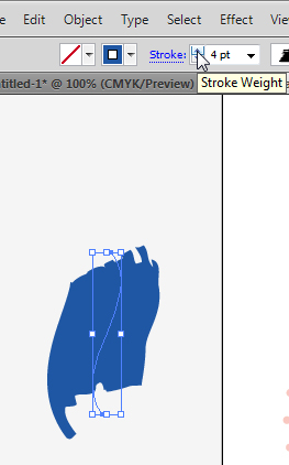
Let's look at a familiar shape I created really quickly. As you can see, it is WHITE on the inside and BLACK on the outline. We call the inside colour FILL, and the outside colour STROKE; you can see these as options on the bottom of the left tool bar.
I can change the stroke weight by going on the top bar and clicking a higher number. See what it does to the stroke on my figure:
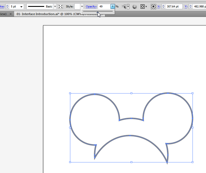
I can also change the opacity of my image by lowering the opacity under the same top bar:
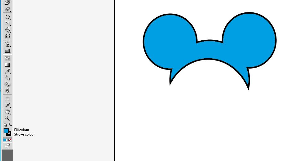
Look what happens when I click a different colour while the fill is selected... the stroke remains the same, but the inner colour is now changed.
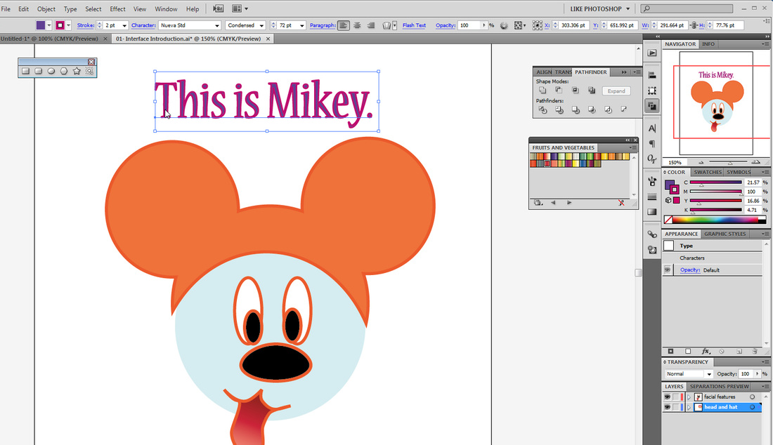
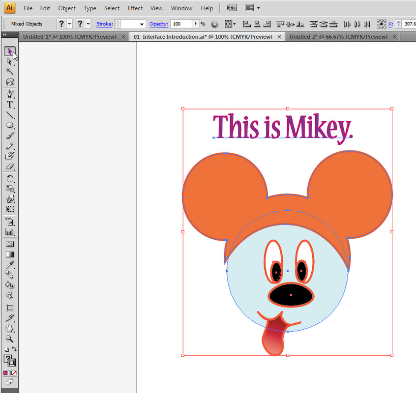
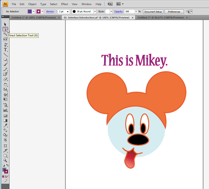
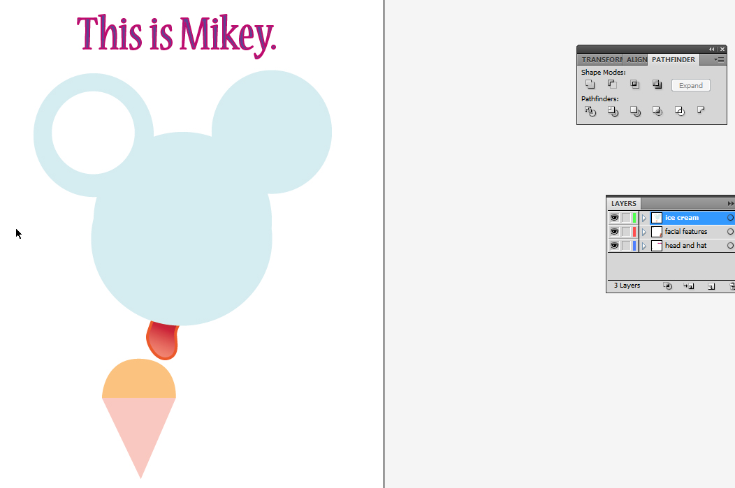
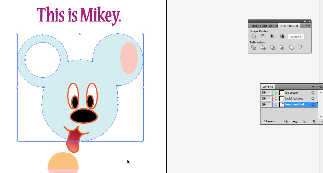
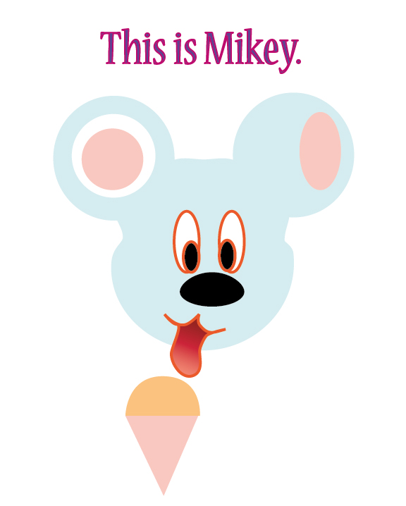
Okay, let's skip ahead a little bit and look at my friend Mikey. DOWNLOAD HIM BELOW.
<any similarities with any known cartoon character is merely a coincidence. Mrs. J does not take responsibility for any misrepresentation regarding a certain character's shape, colour or love for ice-cream.>
<any similarities with any known cartoon character is merely a coincidence. Mrs. J does not take responsibility for any misrepresentation regarding a certain character's shape, colour or love for ice-cream.>
| ai_interface_introduction.ai |
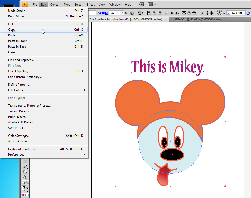
With your selection tool, click on type.
Now that you have type selected, the options of the top bar have changed to adapt to type options. You now have character selections, size of font, text shape and other options:
Now that you have type selected, the options of the top bar have changed to adapt to type options. You now have character selections, size of font, text shape and other options:
If you click on Mikey's hat, you see the stroke thickness and type, the opacity, and things relevant to a shape rather than a type.
Click on it now and check it out:
Click on it now and check it out:
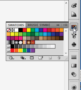
You can select swatches a few different ways.
Swatches are colours that come in little families. They look good together and help us understand color.
You can go to Window -> swatches; you can go to the right bar and click on the third icon; or you could do it through the top bar.
Swatches can also appear as gradients.
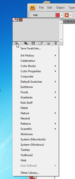
On the top bar, you can find the Swatch library by clicking the two overlapping folders on the bottom left corner of the box below:
Swatches are colours that come in little families. They look good together and help us understand color.
You can go to Window -> swatches; you can go to the right bar and click on the third icon; or you could do it through the top bar.
Swatches can also appear as gradients.
On the top bar, you can find the Swatch library by clicking the two overlapping folders on the bottom left corner of the box below:
This was used to change the colour of Mikey's tongue to a gradient.
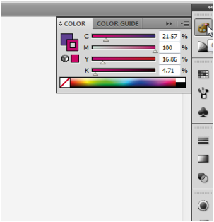
The right bar has some very important tools which you will be using all the time. The first and second ones are colour related, and the third is another way to find swatches.
The right bar has some very important tools which you will be using all the time. The first and second ones are colour related, and the third is another way to find swatches.
|
|
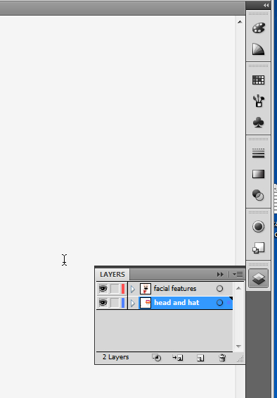
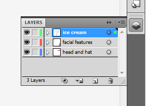
Everything on the right tool bar is important, but one of the things you have to learn right away is at the very bottom. That's right... layers.
See how my layers are labeled and my elements separate? The more complex your image is, the more layers you will have. This way, it is easy to make a whole layer invisible while you refine layers below it.
The layers are coded with colour; see below, one of my layers has a thin red tag on it, and the other, a thin blue tag. When you select elements, they will be outlined on the colour of their layer, so you always know which layer each thing belongs to.
Try making a new layer right now. What colour tag is it?
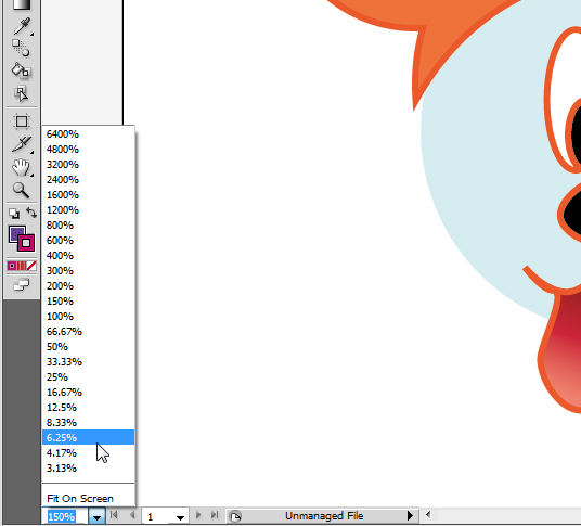
At the very bottom of the screen, you have a precise zoom tool, which is like your usual zoom (below the hand symbol, on the left tool bar) but in this case, you can immediately select exactly how big or small you want to see your image.
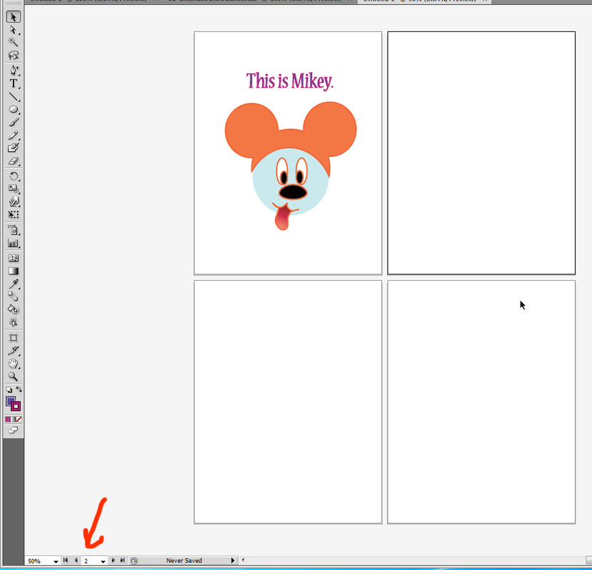
The second area of the bottom bar shows you the artboard you are at. You can have many artboards, and that can be useful if you want to save a number of different versions of the same image. It is particularly useful if you will be exporting the image.
See, I selected one below, and Poof, it came front and center. Handy, right?
Want to see something bad?
This is me working on a logo.
The tiny white box near the top?
Yeah. THAT is my artboard.
Let's NOT do as Mrs. J does! More artboards keep your brain tidy... and you will never lose an element!
This is me working on a logo.
The tiny white box near the top?
Yeah. THAT is my artboard.
Let's NOT do as Mrs. J does! More artboards keep your brain tidy... and you will never lose an element!
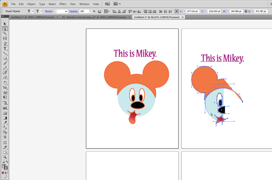
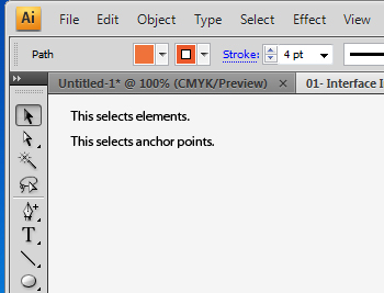
The black arrow is your selection tool. It will select the whole element -- you click anywhere on the thing, and it's all immediately selected. Below I clicked and dragged a selection box over all my elements, much like Photoshop.
Did you notice, though, how when you selected this way, ALL layers get selected? THAT is a big difference from Photoshop to Illustrator. On Illustrator, you can select all things without having to link layers! THANK GOODNESS!
Did you notice, though, how when you selected this way, ALL layers get selected? THAT is a big difference from Photoshop to Illustrator. On Illustrator, you can select all things without having to link layers! THANK GOODNESS!
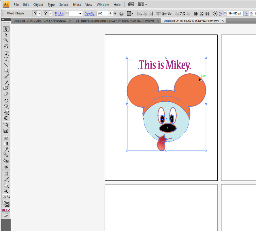
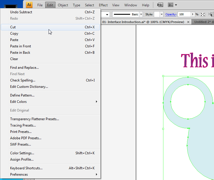
If you want to copy your element to a new file, it's as easy as working with Photoshop. You select your element with the black arrow, clicking at one corner and forming a bounding box around it, and then go to Edit, Copy...
To paste your image to a new file, simply select Edit -> Paste, or press ctrl + V.
NOW WARNING! A COOL thing that Photoshop doesn't have...
The white arrow below the black one is the Direct Selection tool. What it means is, it will select only the anchor points you choose, and allow you to modify them individually or in select groups.
The white arrow below the black one is the Direct Selection tool. What it means is, it will select only the anchor points you choose, and allow you to modify them individually or in select groups.
Ok, check out what I did. I used a bounding box -- the same thing, I clicked and dragged over HALF of my image, so only half of the little anchors are selected.
Then I did edit -> copy....
Then I did edit -> copy....

...and I pasted on my second artboard, on my new file. See how only my selected points moved there?
So, to summarize...
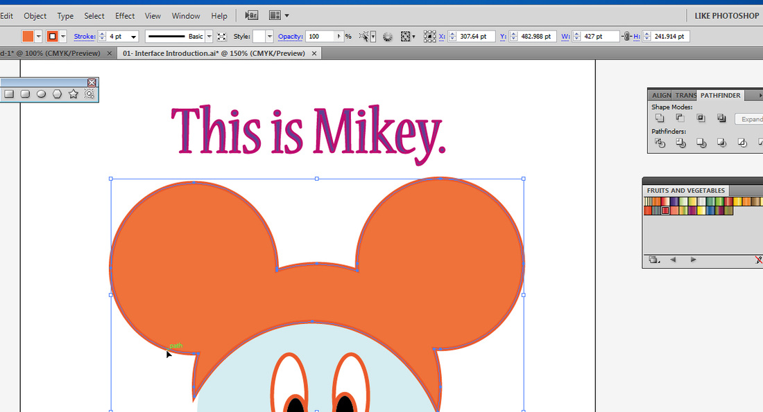
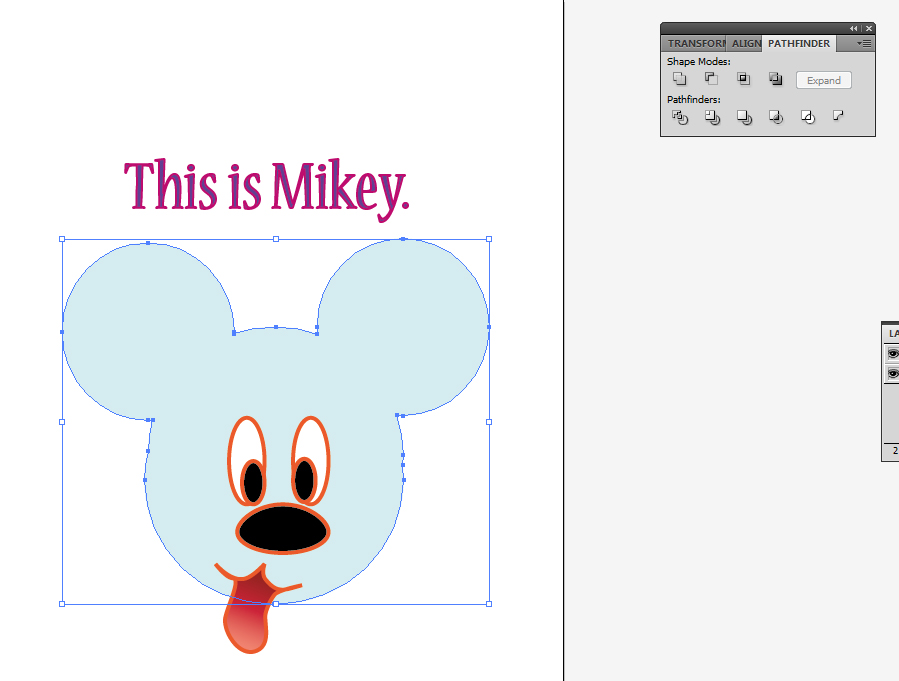
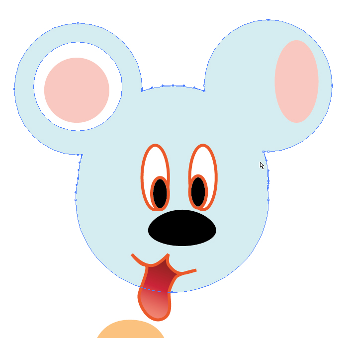
Back to Mikey, let's say you want to make his hat match the rest of his head.
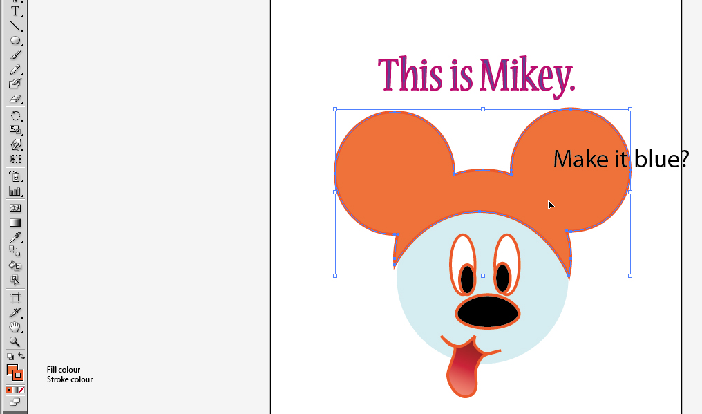
After clicking on the hat with your main selection tool, making sure the hat is selected, you can select the eyedropper...
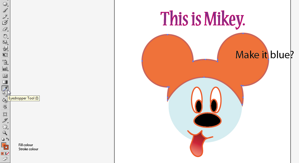
and click on Mikey's head.
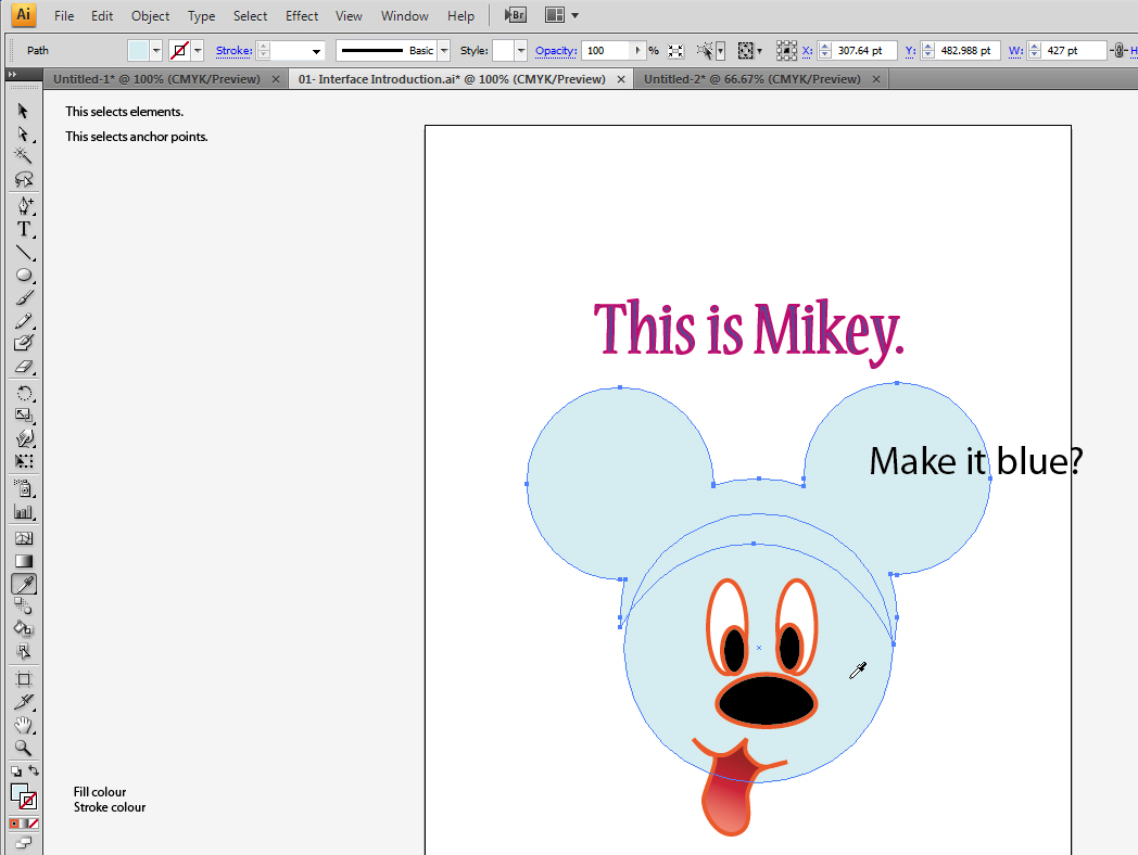
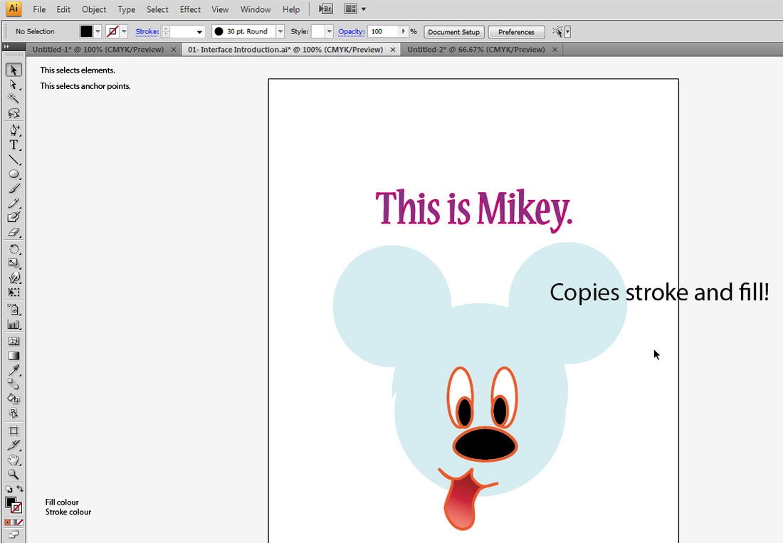
One thing you will notice is, both stroke and fill are now exactly the same as Mikey's head. They used to be different, and the stroke was thicker! But when you use the eyedropper tool, it...
I want to make Mikey's hat a part of his head, so he looks a little bit more like a happy rabbit with round ears.
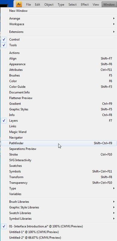
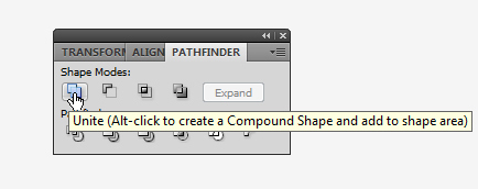
Illustrator has a great set of tools called Pathfinder, which allows you to not only unite things but also subtract them.
You can find the pathfinder menu under Window -> Pathfinder.
I selected both the hat and Mickey's head and clicked unite...
Illustrator has a great set of tools called Pathfinder, which allows you to not only unite things but also subtract them.
You can find the pathfinder menu under Window -> Pathfinder.
I selected both the hat and Mickey's head and clicked unite...
|
|
...this is what I got:
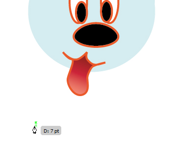
Mikey looks hungry. Let's give him some food.
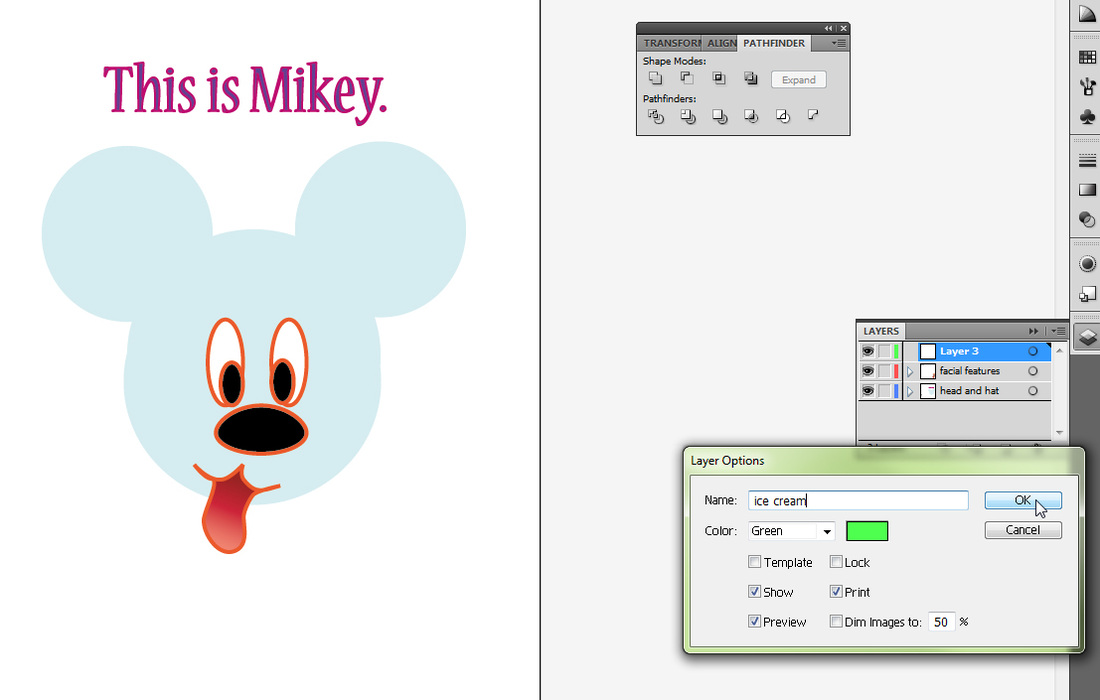
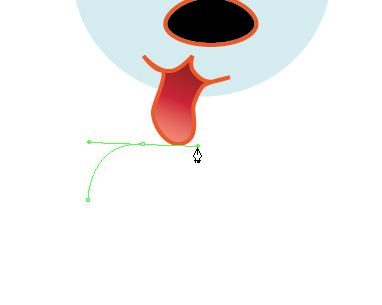
To create a snack, click on the pen tool.
Make sure you make a new layer for the snack!! Notice how the tag colour for my layer is green?
To create a snack, click on the pen tool.
Make sure you make a new layer for the snack!! Notice how the tag colour for my layer is green?
|
|
As I click my first anchor point, it is also green! I continue clicking and dragging, just as we did in Photoshop.
|
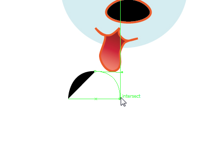
Click and release...
|
Click and drag...
|
Click and release... the fill is set to black!
|
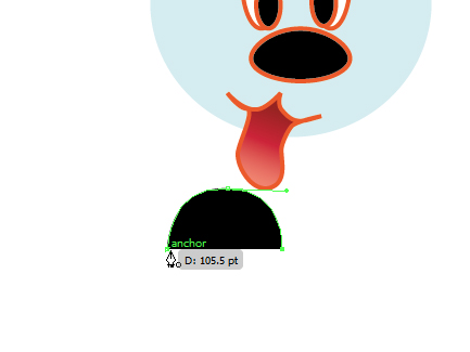
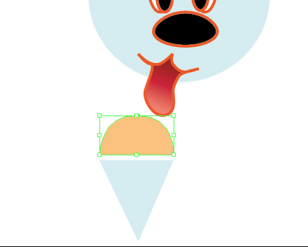
I continued and finished the ice cream, and also a cone.
|
Just like Photoshop, a "0" symbol appears indicating you can close the path!
|
I drew the cone, and changed the colour of the ice cream to beige.
|
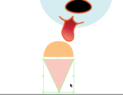
Then I changed the colour of the cone to a pinkish colour. Now it almost looks good...
|
I am trying to get the ice cream to behave like one unit! I am going to try the same thing I did with the head and hat: the unite tool on Pathfinder!
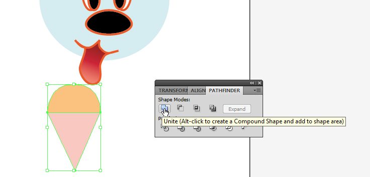
Well. I guess THAT didn't work. What to do then?
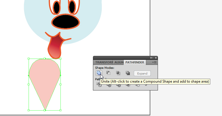
First, I select the ice cream pieces again, and go to Object -> Group.
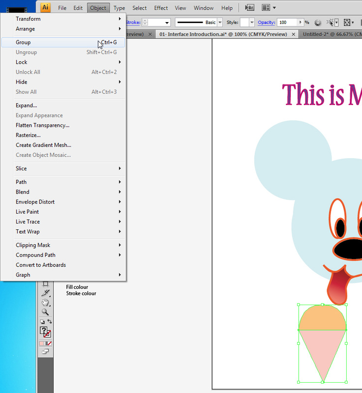
This is an AMAZING thing, and it will save you a whole lot of time, and make your life easy!
Familiarize yourself with it!
Imagine you are working on a drawing of a woman, and she has a ton of hair, and each curl is a separate element, with its unique set of colours... by grouping all the hair together, you can move it and modify it as a single unit, while not mixing their individual characteristics.
Let's continue playing with some more options.
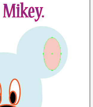
How about making some ellipses?
I can select the ellipse tool and draw a thin ellipse on the ear. If I draw the ellipse while holding the shift key, I can make a perfect circle.
The shift key keeps things in proportion when drawing and also when transforming each element.
Familiarize yourself with it!
Imagine you are working on a drawing of a woman, and she has a ton of hair, and each curl is a separate element, with its unique set of colours... by grouping all the hair together, you can move it and modify it as a single unit, while not mixing their individual characteristics.
Let's continue playing with some more options.
How about making some ellipses?
I can select the ellipse tool and draw a thin ellipse on the ear. If I draw the ellipse while holding the shift key, I can make a perfect circle.
The shift key keeps things in proportion when drawing and also when transforming each element.
|
|
Now, let's see one more element from the Pathfinder.
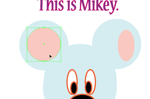
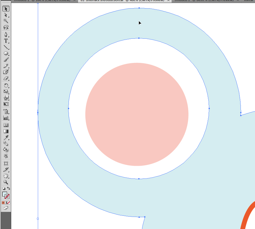
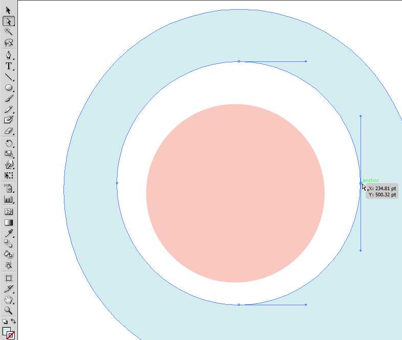
I just selected the body of my friend Mikey, and the circle on his ear.
I want to make a hole on his ear, and am using the circle as a cookie cutter.
I click the command Minus Front inside Pathfinder...
I just selected the body of my friend Mikey, and the circle on his ear.
I want to make a hole on his ear, and am using the circle as a cookie cutter.
I click the command Minus Front inside Pathfinder...
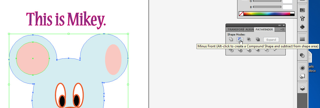
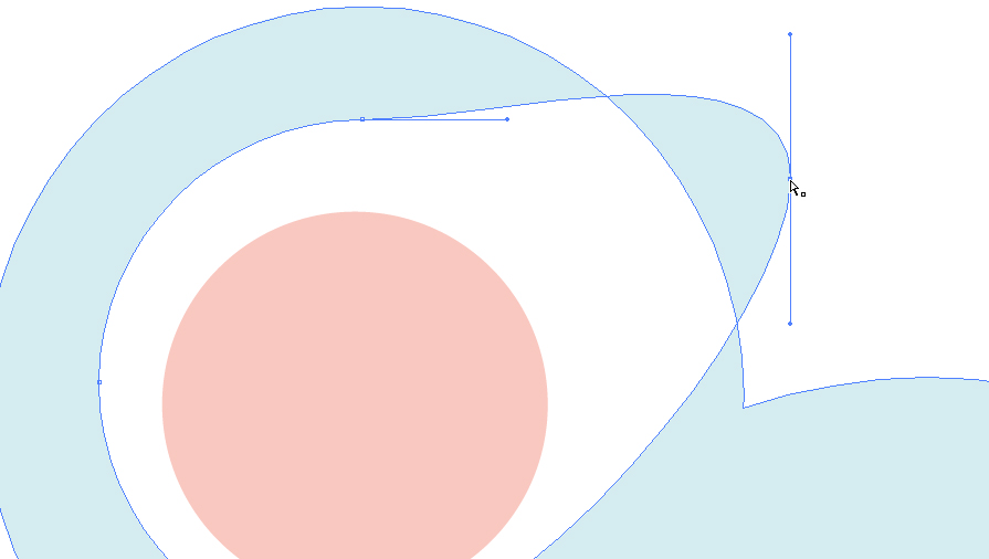
... and the image below happens! But not to worry. If this ever happens when you try subtracting something, it's because Illustrator subtracted it and moved the resulting element to the topmost layer.
See, if you look at the layers menu, you can see the body is now part of the ice cream layer:
See, if you look at the layers menu, you can see the body is now part of the ice cream layer:
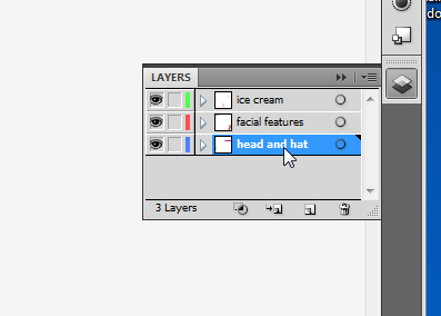
So, what we will do is, select the blue body, and then go to Edit -> Cut...
|
|
... then click on the correct layer, and go to Edit -> paste.
|
|
Let's keep changing Mikey!
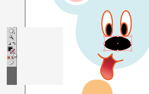
See how his nose has a stroke, or outline?
Let's turn that off. You can choose to have nothing selected for both stroke or fill, and this is very good to know.
Of course if you do it to both, your image will disappear... :)
Just click on the stroke box, and then click on the white box with a red slash through it...
|
|
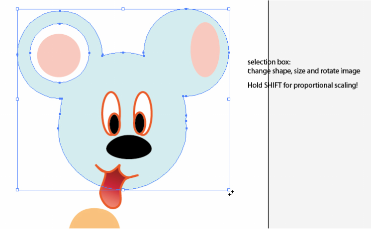
As mentioned before, you can select your elements and quickly alter them -- you can change their shape, change their size and rotate them, simply by manipulating the bounding box. To rotate, try getting near the corners, and you will see curved arrows indicating you can rotate the element.
Now, let's look closely at what happens when you select something with the black arrow, or selection tool, versus the white arrow, or direct selection tool.
|
When using the selection tool, ALL the little anchor points are filled:
|
But when using the white arrow, only the anchor point selected is filled:
|
And when you move it, only the selected point responds to the command:
|
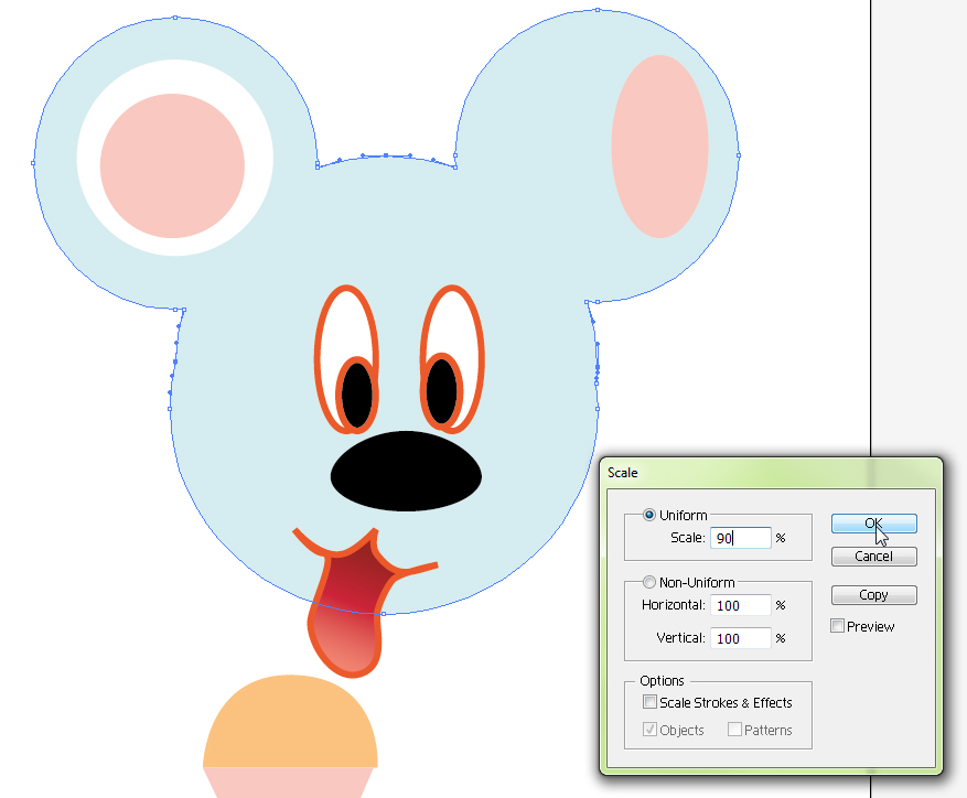
Let's say you want to modify only a few points, in relation to each other... for instance, I want Mikey to have a more interesting face, and so, I will select three points to modify, one on top of his head, and one on each side of his head:
If I go to Object -> Transform -> Scale and select a percentage, I can determine how much smaller I'd like the space between my points to be, which is going to bring those three points closer together:
|
|
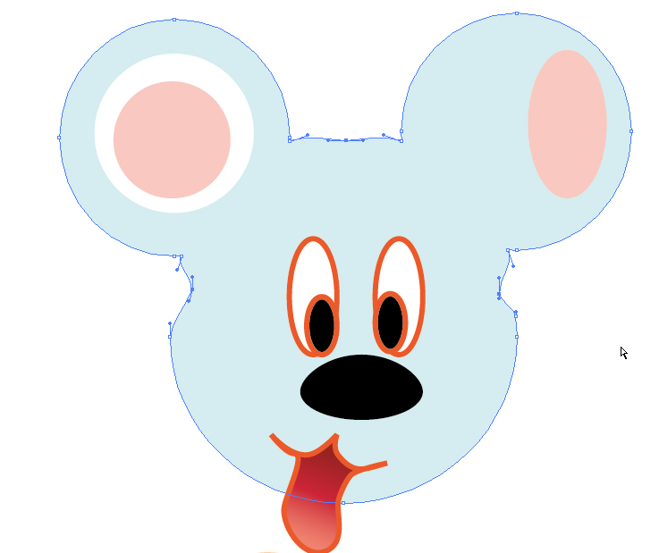
By clicking with the white arrow and selecting those points, I am able to move the handle bars on each side and achieve a smoother look to my rabbit drawing:
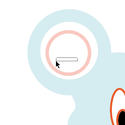
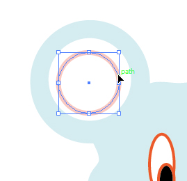
Now, change your stroke to pink, and make your fill invisible instead.
Try to click inside of the circle to select it.
Notice you can't, because it is now empty. To select something with nothing for a fill, you have to click on the outline itself.
Try to click inside of the circle to select it.
Notice you can't, because it is now empty. To select something with nothing for a fill, you have to click on the outline itself.
|
|
|
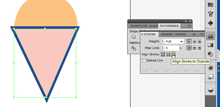
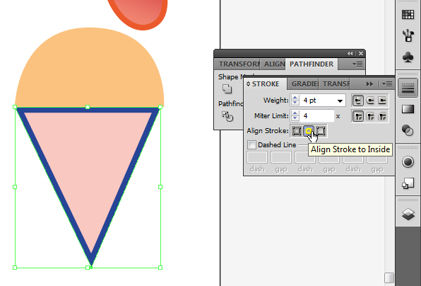
While we are going over strokes, check out the stroke panel, located on the right tool bar.
You can set the stroke to match the outside of the element, the inside of the element, or in the middle. See the difference below:
You can set the stroke to match the outside of the element, the inside of the element, or in the middle. See the difference below:
|
Check out how much bigger the outside stroke is in comparison to the inside stroke:
|
|
Under the same menu, you can also select other cool options, such as making the stroke go around corners.
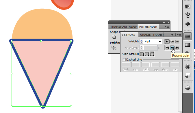
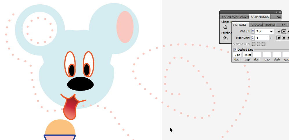
You can even use the stroke to create a dotted line. Try checking the dashed line box, and adding 2 to the first dash box:
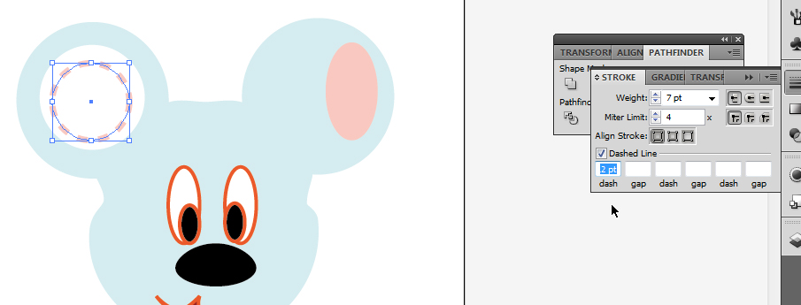
Pretty cute, right?
Please try adding something else to the gap box, and then add something different to the second gap and the second dash, and the third gap and dash... Weeeeee!
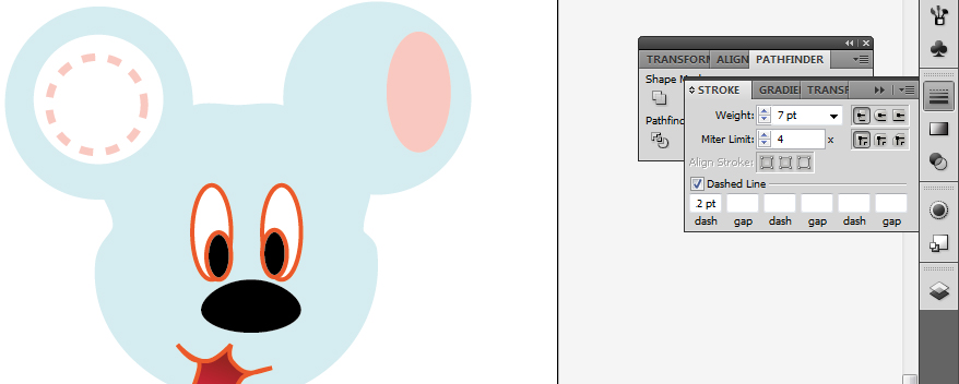
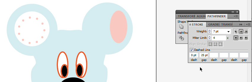
If you want a perfect dotted line with round little dots, then you have to set your dash size to zero, and maybe try a gap of 25...
If you want a perfect dotted line with round little dots, then you have to set your dash size to zero, and maybe try a gap of 25...
You can make any shape with your pen tool, and apply the dotted stroke to it, just as if it were a regular stroke.
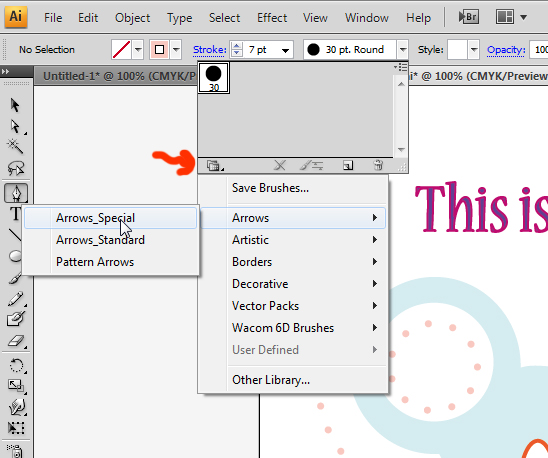
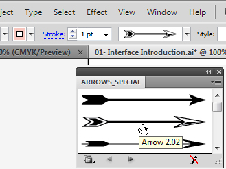
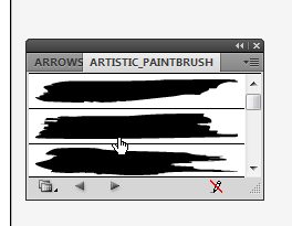
Since we are speaking about fancy strokes, did you know you can use presaved objects to make strokes on Illustrator?
With your pen tool selected, if you click on the arrow pointing down next to your defined brushstroke, you will find that it will open a little drawer. In my case, my drawer is pretty sad and there is only one paintbrush inside it.
BUT if you click on libraries -- the symbol is two folders overlapping -- then you can get an array of different drawers to play with, filled with brushes. Try it! To the right, you see the arrows_special drawer which popped open. I selected one arrow...
|
|
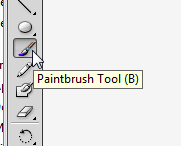
To try something more free-flow, you can use the paintbrush tool to create vectors that don't require clicking and reorganizing anchor points. It's a good way to sketch something, and then go back to it and define it better by deleting anchor points, adding and modifying them, etc.
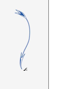
Select paintbrush from the left tool bar, then click on the desktop and drag, just as you would a pencil.
Note that as you draw strokes, the arrow follows your movement, and adapts to the size of your stroke:
Select paintbrush from the left tool bar, then click on the desktop and drag, just as you would a pencil.
Note that as you draw strokes, the arrow follows your movement, and adapts to the size of your stroke:
|
|
|
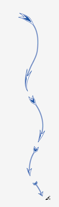
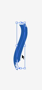
You can also change an existing stroke.
Let's open another drawer under the strokes library. I picked Artistic_Paintbrush.
See what happens when I click a paintbrush stroke while I have my arrow selected:
Let's open another drawer under the strokes library. I picked Artistic_Paintbrush.
See what happens when I click a paintbrush stroke while I have my arrow selected:
|
|
And that's not all. If you select the stroke, and increase the weight, it alters the thickness of the stroke, just like a regular stroke:
|
|
This is just a taste of the immensity found within Illustrator.
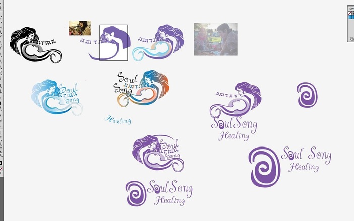
Now that you are a little more aware of the tools found on Illustrator, use this knowledge to create a quick logo. Here are some for inspiration. You may try copying one, or coming up with one of your own... tomorrow, we will see more about colour and get started with our second assignment!
Now that you are a little more aware of the tools found on Illustrator, use this knowledge to create a quick logo. Here are some for inspiration. You may try copying one, or coming up with one of your own... tomorrow, we will see more about colour and get started with our second assignment!

|

|

|

|
